How Do You Match Plain Colours with Printed Fabrics?
The easiest way to coordinate plains and prints is to use colours already present in the printed design.
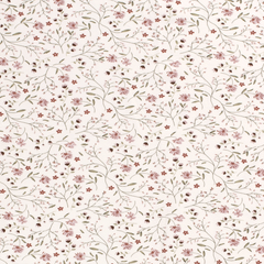
For floral prints, select a background colour or one of the main floral shades. Neutral plains can create a softer combination, while stronger colours make the collection more expressive.
For geometric and abstract prints, choose one dominant colour and combine it with a matching solid fabric. This creates a consistent appearance without repeating the entire pattern.
For multicoloured prints, select two or three plains that reflect different shades within the design. These colours can be used across separate garments or accessories.
For minimalist collections, combine subtle prints with neutral colours such as cream, beige, navy or black. This allows the print to remain the main visual element.
Always compare physical fabric samples in natural light. Colours that appear similar in photographs may differ in undertone or intensity.
What Should You Consider When Combining Plains and Prints?
Matching colours is important, but the fabrics should also work together in terms of appearance and performance.
Colour coordination: select shades that complement the printed design and maintain a consistent palette.
Fabric composition: similar fibre compositions can make it easier to achieve comparable wearing and care characteristics.
Weight and drape: fabrics with compatible weights and movement generally create more balanced garment combinations.
Stretch and recovery: particularly important when combining knitted fabrics within one garment.
Print scale: large patterns create stronger visual statements, while smaller prints are often easier to combine with basics.
Opacity: check whether light-coloured fabrics require lining or additional coverage.
Shrinkage and care: combined materials should have compatible washing and dimensional behaviour.
Availability: matching plains should ideally remain available for repeat orders and future collections.
Evaluating these characteristics helps create combinations that are visually attractive and practical for clothing production.
How Can You Create a Coordinated Collection with Plains and Prints?
A coordinated fabric collection usually begins with a clear colour palette and a small number of complementary designs.
Start with one or two statement prints that establish the collection's style. Select several matching plains based on the main colours within these designs.
Use plain fabrics for versatile garments such as T-shirts, trousers and simple tops. Printed materials can introduce variety through dresses, blouses, skirts and other statement pieces.
Combining different print scales can also create interest. A large floral design may work alongside a subtle stripe or small geometric pattern, provided the colours remain consistent.
For fabric retailers, displaying matching plains next to printed fabrics can help customers visualise possible combinations. For clothing brands, using the same palette across different silhouettes strengthens the collection's identity.
A focused assortment with carefully selected colours and patterns can offer more coordination possibilities than a large selection of unrelated prints.